Monday, December 13, 2010

Packaging


I created packaging for specialty thread, sewing machine needles, and sewing machine feet

Thursday, December 9, 2010

Packaging Pattern


This is the pattern for the background of my packaging. It has needles and thread, like the name of the company. Also, the thread is purple, and the needles are black, like in the logo.

Wednesday, December 8, 2010

Packaging Logo


This is the logo for my packaging product company. The company sells sewing machines and accessories. The read in the logo is for speed. The purple (the thread) is for elegance. The ivory is for quietness. These are excellent qualities in sewing machines.

Friday, December 3, 2010

Pattern

For my pattern, I started with the illustrator design that Mrs. Klein gave us. I took pieces from it and created the corners. Instead of reflecting, I rotated them creating a spiral.

Thursday, December 2, 2010

Business Card

Front

Back
For my business card, I used colors according to my original logo. I used the same font as my logo as well. I added the swirls so that it would look less bare.

Monday, November 29, 2010

CATE Logo

I chose this design for my CATE logo because it is 
simple. Also it has CATE as well as what it stands for. In addition, it uses the school systems's color.

Friday, November 12, 2010

My Company Logo


My company name is Natalie Pratt Designs. I chose a green color to symbolize life and well being. I mixed some blue into the green to instigate truth and honesty. Last in the color, I made it look good. I chose this design because it shows the company name without having it written out. It also does not depend on the color to make sense and look good.

Friday, October 29, 2010

Personal Expressions


For my image, I used live trace to change myself to various shades of brown. When I was deleting the extra space, part of my face was deleting also because the shadow made it black, the same color as the back ground. I ended up deleting this space by changing the outline and using the eraser tool. I then made a brown spiral background using a rectangle and the pen tool. I grouped my picture and the background together and locked them in place in order to get started on adding my words.
I used five different fonts for my words and set them all as the same medium to light pink color. Two of the fonts I chose to use because they gave it a western feel. In a couple spots I had a main word with word connected to it branching off I also did this on my picture.


Friday, October 8, 2010

Dairy Queen Logo

Original Logo
                                                               
Recreated Logo

For the red background, I combined an ellipse and a hexagon. In order to make it the exact shape, I added and subtracted anchor points in a long, slow process.
I used Lao UI regular for the DQ. For the trademark symbol, I created a circle using the ellipse tool. I increased the outline and set the fill to none. I then put a R, using Corbel bold, in the center.
For the yellow and blue figures, I started out with a rectangle, I then changed some anchor points around to get started, then I used the reshape tool in order to create the right shape. The reshape tool kept acting up and sometimes would not act the way it should have.
For every part, I lowered the opaqueness of the figure I was creating in order to see the shape below to match it as close as I could.


Friday, September 24, 2010

Splat Text

Revised Personal Quote

When I altered this quote, I increased the leading in it so that it would not be as cramped, and therefore would be easier to read.
I also changed the green to a cross between dark green and olive green. This combination of colors symbolizes ambition, greed, jealousy, and peace; it therefore symbolizes life in its every form.
I lightened the yellow a little as well because warm colors jump forward in a design, and the yellow had been hard to read.
I made the blue a bit bluer, therefore symbolizing stability a little more
The pink is also a little pinker, and it symbolizes love.

Spiral

Thursday, September 2, 2010

Evaluating Artwork

                                                                   Graceful Dancer

 The curves in the arms of the dancer make her appear graceful. By the blurring of the background, the dancer appears sharper, more in focus, making one feel her more. The softness of the dancer makes one feel calm.


                                                                   Business Woman

The vertical lines make her look alert. With her bangs very straight and diagonal, she appears stern. The gray tone makes one ready to work. The fuzziness of the outline makes one focus more of the interior details rather than the whole shape.


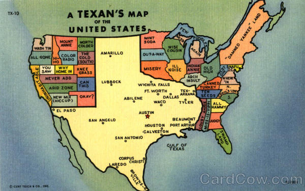
                                                    Texas View of the United States

The size of Texas in this map makes it seem really big. The long lines on the Texas compared to the other states give an added effect of being large. The elongated shape of the Texas makes it seem dorky, but at the same time it and the huge size, put Texas in charge, and the other states very low on the todum pole.


                                                                       Silhouette

The value of the picture makes the girl appear sad. The round features on her face give her a look of infinity, like she will be there forever.


                                                                        Red Rose

The lines of the petal on the rose create a spiral, which suggests infinity, making the rose seeming to go on forever. At the same time, the petals are multiple curved lines, which makes the rose graceful.


Thursday, August 26, 2010

Graphic Design

I am really excited about my Graphic Design class. I can't wait to learn all that we are going to learn in this class.